


Breaston, Derby
United Kingdom

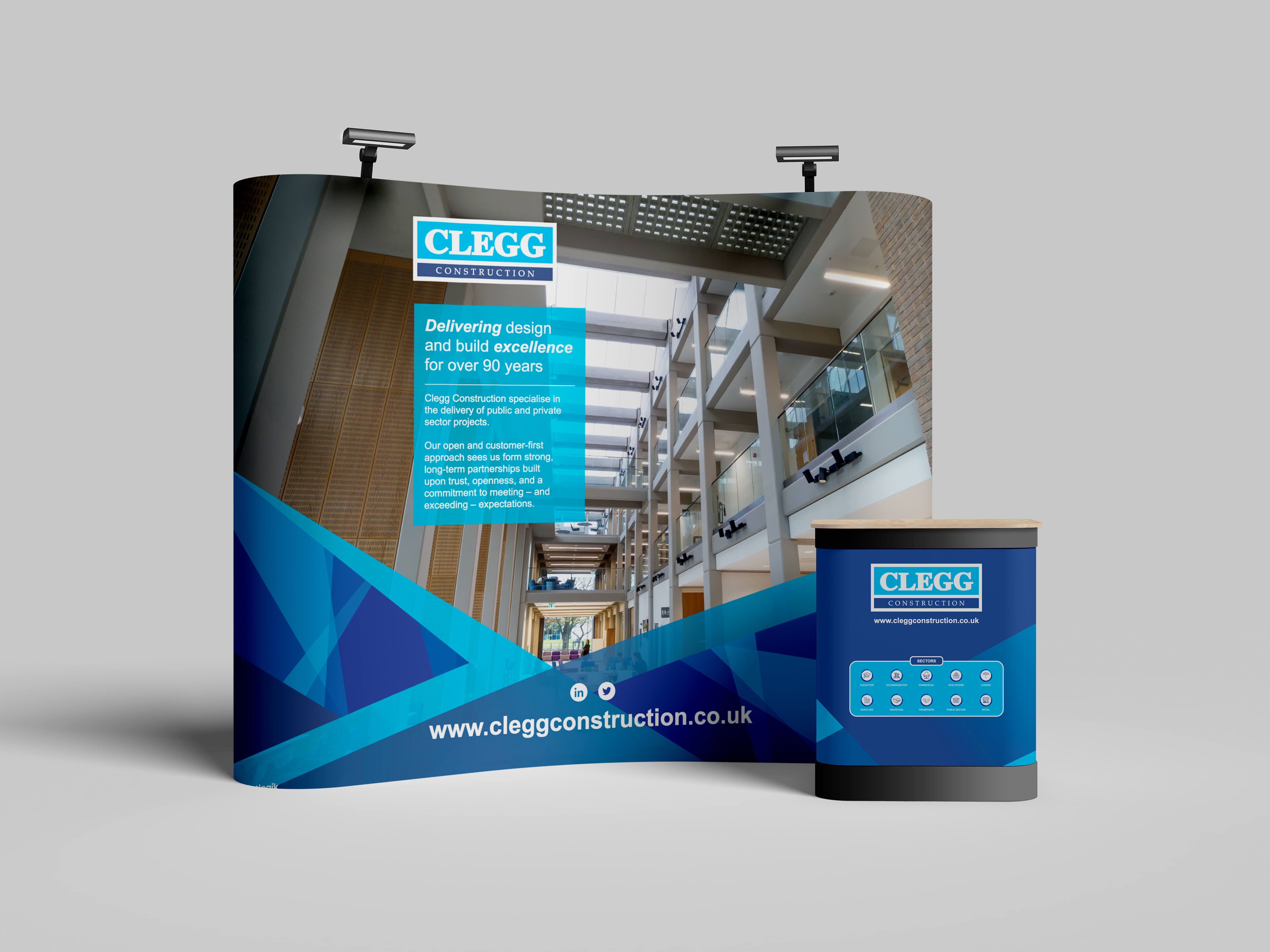
The first commission involved the design of a pop-up exhibition stand system for use at trade shows and corporate showcases. The goal was to create a modular environment that communicated reliability, expertise, and professionalism; qualities synonymous with Clegg Construction’s reputation.
Working within the company’s existing brand guidelines, Leivars refined and simplified the visual language to introduce greater boldness and clarity. The stand system featured a curved wall and reception counter, wrapped in clean architectural imagery and typography. Colour, proportion, and layout were carefully balanced to project confidence and precision while maintaining approachability.
The result is a flexible, transportable installation that gives Clegg Construction a consistent and modern presence across a range of professional settings, helping the company stand out in competitive trade environments and engage clients with clarity and confidence.
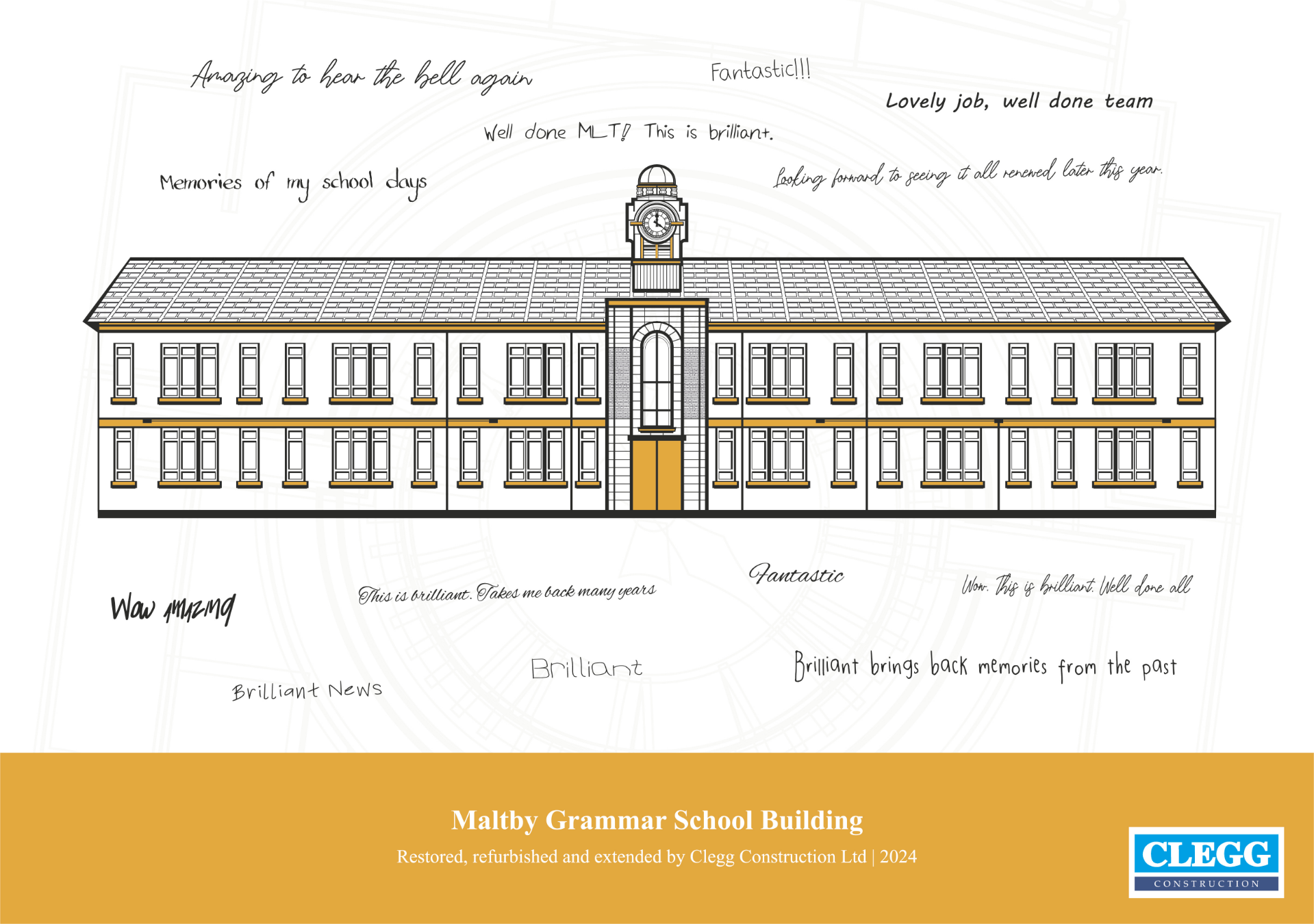
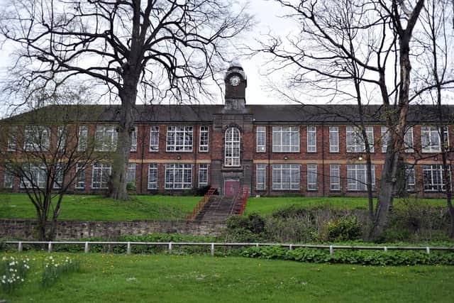
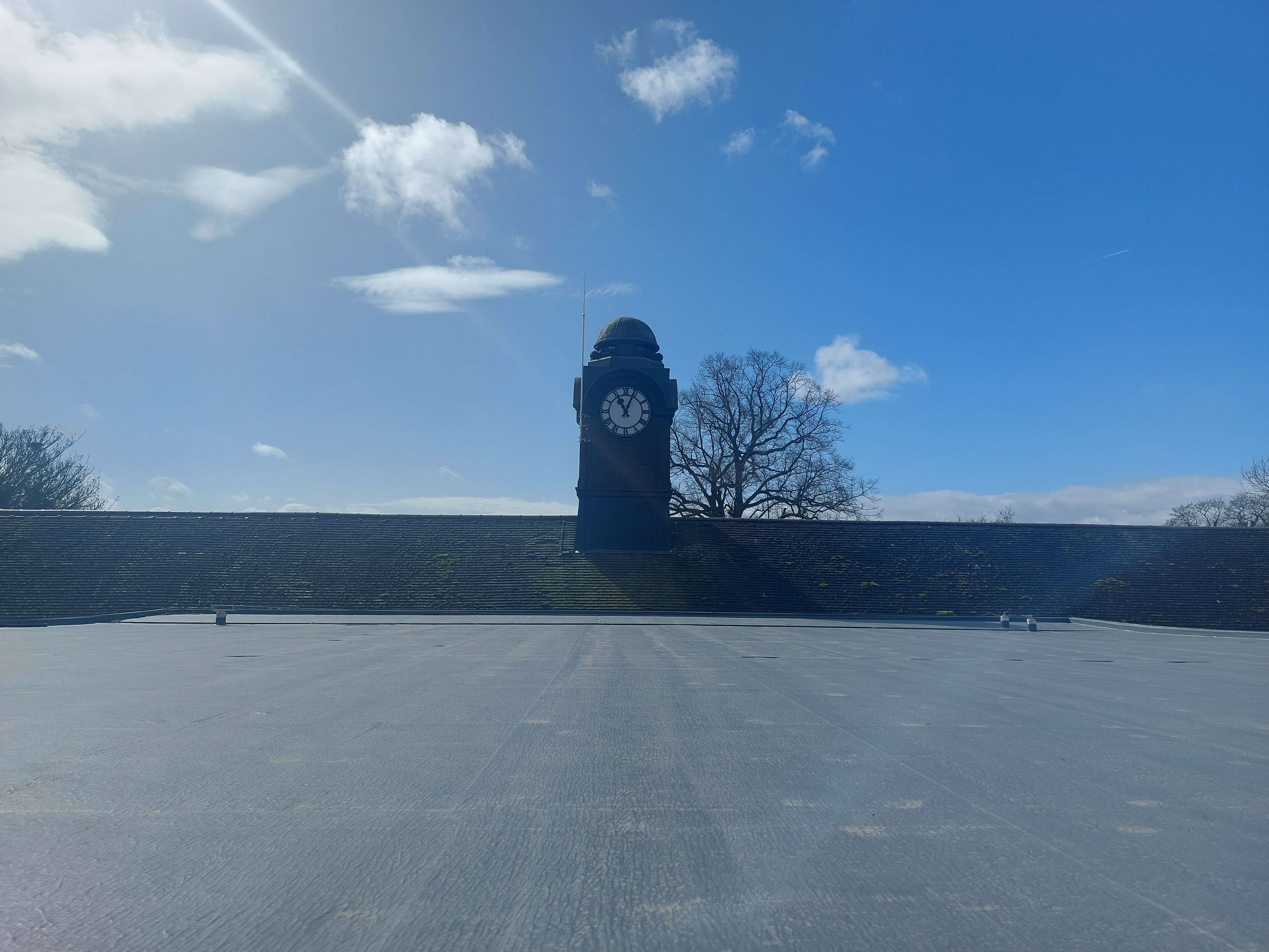
Alongside the exhibition materials, Printlogik developed a commemorative illustration celebrating the renovation of the historic Maltby Grammar School Clock; a significant restoration project undertaken by Clegg Construction.
Created in collaboration with an in-house illustrator, the artwork is a detailed line drawing with selective colour accents, capturing the character of the renovated building with architectural precision. The piece balances technical accuracy with restrained corporate styling, aligning with the company’s visual standards while honouring the craftsmanship of the project itself.
The illustration was printed and framed for permanent display within the renovated site, serving as both a commemorative gesture and a lasting symbol of Clegg Construction’s contribution to the project. Together, these assets strengthen the company’s visual identity and reinforce its dual commitment to professionalism and craft across every touchpoint.
Creative Direction, Design, and Strategy: Bradley Leivars
Illustration: Printlogik's Studio Team