


Breaston, Derby
United Kingdom


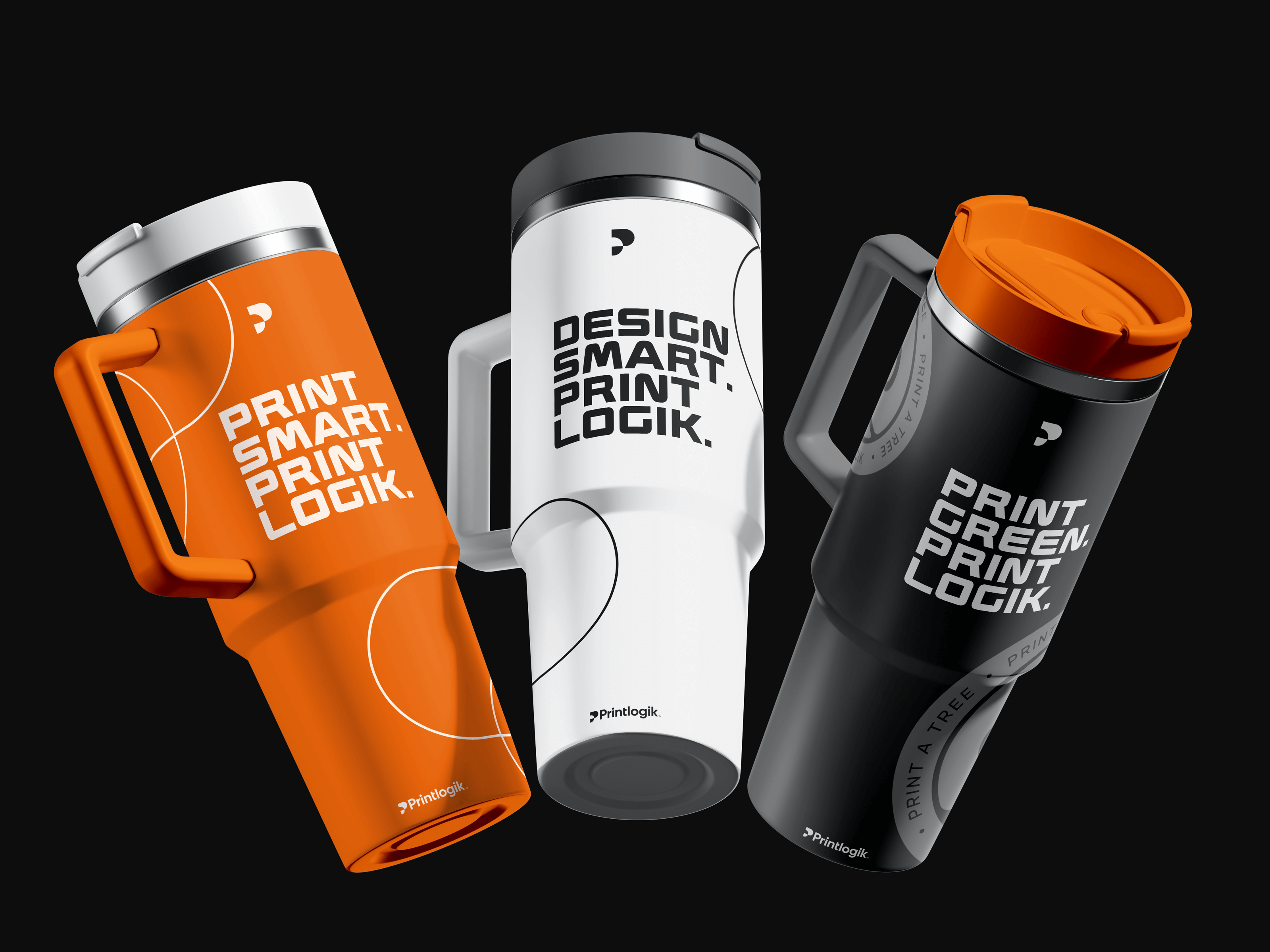
Printlogik was founded to bring clarity and modernity to the world of print, an industry often defined by complexity, outdated systems, and transactional relationships. The ambition was to create a brand that reflects the intelligence and craft behind modern printmaking while remaining approachable to a wide spectrum of clients, from independent studios to established organisations. The identity, conceived and developed by Bradley Leivars, captures this balance through a visual system that merges precision with personality. At its core is a custom “P” symbol derived from the structure of registration marks used in professional printing. This reference connects the brand to the heritage of the medium, while its minimalist, engineered form situates it firmly within a digital context.
The logomark operates as both symbol and system, scaling easily across digital and physical applications. Its geometry establishes a framework for layout, typography, and motion, providing a consistent visual logic throughout the brand. Typography was selected for its clarity, rhythm, and warmth, ensuring every piece of communication feels both professional and personal. The palette of orange, white, and black introduces contrast and energy, creating a distinctive identity that stands out within a traditionally muted sector. The tone of voice continues this approach: clear, confident, and generous, designed to make the process of printing feel intuitive rather than technical.

Beyond its core identity, Printlogik’s system extends seamlessly into its digital platforms and physical materials. The website and ordering experience were designed to feel as considered as the printed work itself, combining efficiency, transparency, and visual simplicity. Each element reinforces the brand’s belief that print can be both tactile and technological, where craftsmanship meets convenience. Three initiatives, Print a Tree Project, PrintPass, and ActWidget, sit within the wider ecosystem of the brand. The Print a Tree Project links every order to verified reforestation projects, while ActWidget provides accessibility tools that ensure inclusive digital experiences. These initiatives demonstrate how Printlogik’s values of sustainability and accessibility are built directly into its business model, not treated as afterthoughts.
Since launch, Printlogik has grown to serve a diverse range of clients, from startups to creative agencies and large organisations. The brand stands apart for its clarity, sustainability, and design integrity, achieving the familiarity of larger competitors like Moo or VistaPrint, while retaining a personal, craft-oriented sensibility.
The identity gives Printlogik a coherent and confident presence: a reflection of its purpose to make great print simple, sustainable, and beautifully executed.